 by: Peg Heckman
This is an example of a bad composition. The subject of the photo, which is the person, is in the middle of the picture which breaks the rule of thirds. Also, the roof of the building looks like it’s attached to his head at first glance. The tree at the side also gets you distracted from the subject of the photo making you confused of which one to look at.
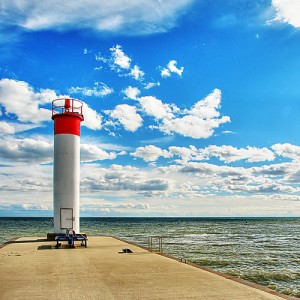 Whitby Harbour by Rick Harris
This is an example of a good composition. The subject of the photo is the pier and the lighthouse, it’s not in the middle which follows the rule of thirds. Also, the picture has a lot of texture, the accents on the clouds, the color of the lighthouse and how the water becomes dark.
Perfect example, very inspirational 😉